Photoshop Tutorial: Vlad the Merry-Go-Impaler

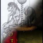
I thought it might prove interesting and or useful to chronicle the coloring process I go through with a drawing. Before I dig into it let me introduce you to this work. I decided that I wanted to colorize a recent drawing. This may seem like a rather unusual piece to turn into a tutorial due to it’s morose subject matter. I call this Vlad the Merry-Go-Impaler. It was hand sketched and shaded with graphite. The original is 8.5” x 11”. I intentionally misrepresented proportions and perspective in this. I wanted it to resemble the work of Byzantine artists and their disregard for realistic portrayals. The table for instance is at an absurd angle and the horses would be gigantic in reality. Vlad must disapprove of my artistic liberties. That explains his grouchy face.
This isn’t necessarily a follow-the-letter tutorial on photoshop. I don’t work in the fastest manner and I don’t use all the shortcuts. For instance, I generally avoid the magic wand tool for this sort of work. I prefer the fidelity my hand + wacom tablet gives me in going over edges. The problem with the magic wand is that it will capture the edge of objects and when it’s a scanned graphite image the edges will be soft and I usually want one color to overlap the other. As such, I’ve found it easier to trace my own edges on top of the scanned image.

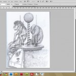
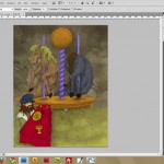
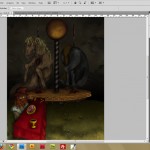
Image 1 is the scanned original.
As you can see I develop my drawings pretty far traditionally before I scan them in. I have the shadowing realized and everything is where I want it. Because I take this approach you’ll see that most of my coloring in photoshop takes advantage of multiply style layers and brushes. Multiply allows the lower detail to show through, albeit with a darker veneer. This method appeals to me because it’s akin to oil painting with liquin. To challenge myself I also decided to add a different light source in photoshop. The lighting in the original is a mostly flat-on default light. Once I started working on it I wanted to give it a high contrast, dark, lower foreground campfire lighting effect. You’ll see that develop as each step evolves.

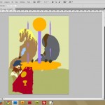
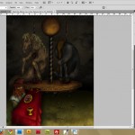
Image 2 shows basic color shapes.
The first step I take is to block out all the shapes on separate layers. I made a folder for each horse, a folder for Vlad, a folder for the Carousel and so on. This helps keep things organized and if I change my mind later I can easily edit it because each object is its own layer. Blocking everything out is the most time consuming part. I know I could use the magic wand and do this much quicker but sometimes it feels better to do it by hand…. virtually…. hmm…. never mind, I just like doing it this way. I do use the magic wand a bit once I have a shape drawn in with the photoshop brushes. I do it this way so I have more control over the edges.

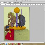
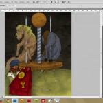
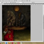
Image 3 shows the color shapes with a multiply blend effect.
The only change is that I applied the multiply blend effect on the layers. Actually, to make it easier I apply the multiply effect to each GROUP of LAYERS. By doing it that way I can easily toggle the blend effect on and off by affecting the whole group of layers instead of having to do it on each individual layer.

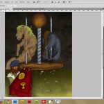
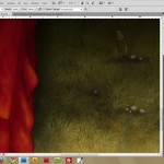
Image 4 we can see some background elements taking shape.
Because I did a lot of shading already in pencil before I scanned it a lot of the preliminary depth and rounding of the shapes is already there. Now begins the fun part. I started with the background sky. The idea here is to get all the areas more realized. I don’t want to only work on the sky and completely finish it and then work on the horse and finish it and move on and so on. Each shape affects the adjacent shapes. It will all need to be formed together. Colors reflect and absorb near each other. If you only work on one piece at a time things will feel cut and pasted and lifeless.
For the background I used a motley assortment of brushes. I used some of the default dry medium brushes for texture, some cloud brushes and ink splatter brushes I found from free download sites and the basic airbrush brushes. For the ground I used free grass texture brushes from download sites. I’ll post the links at the bottom of this article for reference.

In Image 5 I darkened up the sky more.
The process I like to use once I start shading is to select the blocked in color shape and then make a new layer with that selection still active. That way I have the outline of the shape selected and I add shadows, highlights, texture and what-not on a new layer using that magic wand selection as a stencil. This way you can also easily see the progress you are making by making that detail work layer visible or hidden.

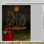
Image 6 consists of rounding out elements more. I added more depth to the carousel, put more depth of field shading on the ground and added more contrast shading to the table.

In Image 7 I decided to change his hat color. I also wanted all of this to be very dark, as if lit by a campfire off-screen in the bottom foreground so I started to add shadow to hint at that.

Image 8 has further development of the dark, moody lighting.

In Image 9 I made separate layer to add in some fire highlights. I also deepened some shadows.

Image 10
This last step probably isn’t visible but I flattened the image and went over edges of shapes with either the clone stamp, blur, or smudge tool to clean up any derelict pixels.

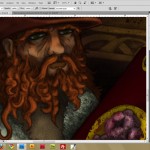
Image 11 Close-up detail

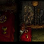
Image 12 Close-up detail

Image 13 Desktop wallpaper
There you have it. I hope you enjoyed this peek at how I use photoshop to color a drawing. Also, I coincidentally made this work for sale over at imagekind. It is also in the drawing gallery and I made it a free desktop wallpaper above.
Where to find free Photoshop Brushes:

Nice tutorial! I need to learn how to make folders for sections of photoshop documents like you do to make them easier to edit. It’s hard to keep layers organized