Website Development Timeline
It’s a new year which often means a time of reflection. I thought I’d look back at my website and how it has changed over the years.
 [click on image to view larger]
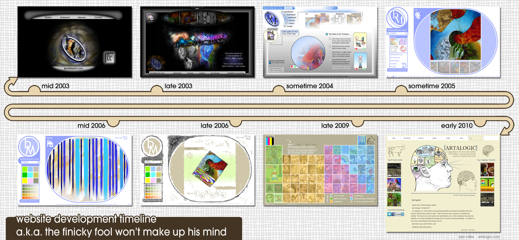
Website Development Timeline
- mid 2003; a brave new world, a doe-eyed ben decides to make a website. It has a nice, big, centrally located logo that reminds most people of bowel movements with what might be a moldy meatball in the background.
- late 2003; I was beginning to understand the need to actually SHOW my art on the main page. I still couldn’t let go of my logo.
- sometime 2004; sigh… guestbook? Seriously? Guestbook is the first menu choice? Yeah, because, you know… the first thing on people’s minds when they view a website is to electronically sign their name. *slaps self in face
- sometime 2005; I really liked this design but the round ovals ended up cropping the art too much. I got side-tracked with form and wasn’t properly considering function.
- mid 2006; pushing that oval idea even further. I turned the menu into a color chart which sure looks cool but wasn’t very intuitive… at all.
- late 2006; I started to feel too formal so I roughed it all up. Looks ok but still suffers all the same usability issues that plagued this approach.
- late 2009; I realized the problems of that oval template and started from scratch. I took the periodic table of elements as the inspirational springboard for this iteration. I really liked this version of my site but it was NOT easy to update with new works. I had to shuffle it all around each time I wanted to add a new piece of art.
- early 2010; the first version in wordpress. My idea for this version was to make it all look like old scientific illustrations. I ultimately abandoned this idea because I felt it was overpowering the presentation of my art. For instance, if I posted something that was futuristic your view of that futuristic art was immediately biased unintentionally by me because I was presenting it to you through the filter of old scientific illustrations.
And there you have it. What does the future hold? Hopefully not too many different versions of my site. The less time I spend revamping the site the more time I can spend creating the art that gets presented on my site.


